05 / Brand Identity
The brief
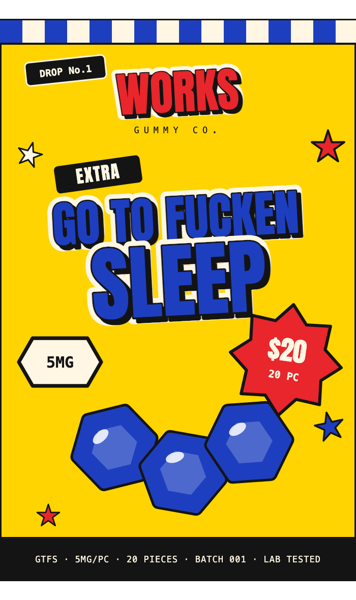
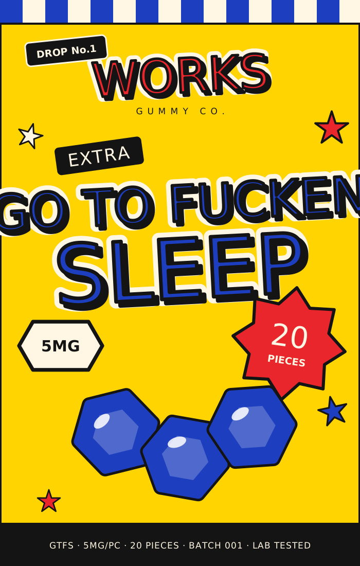
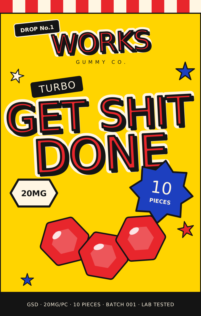
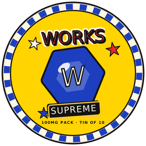
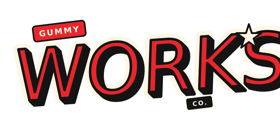
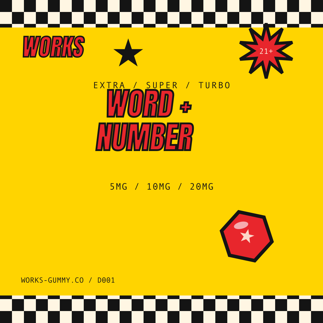
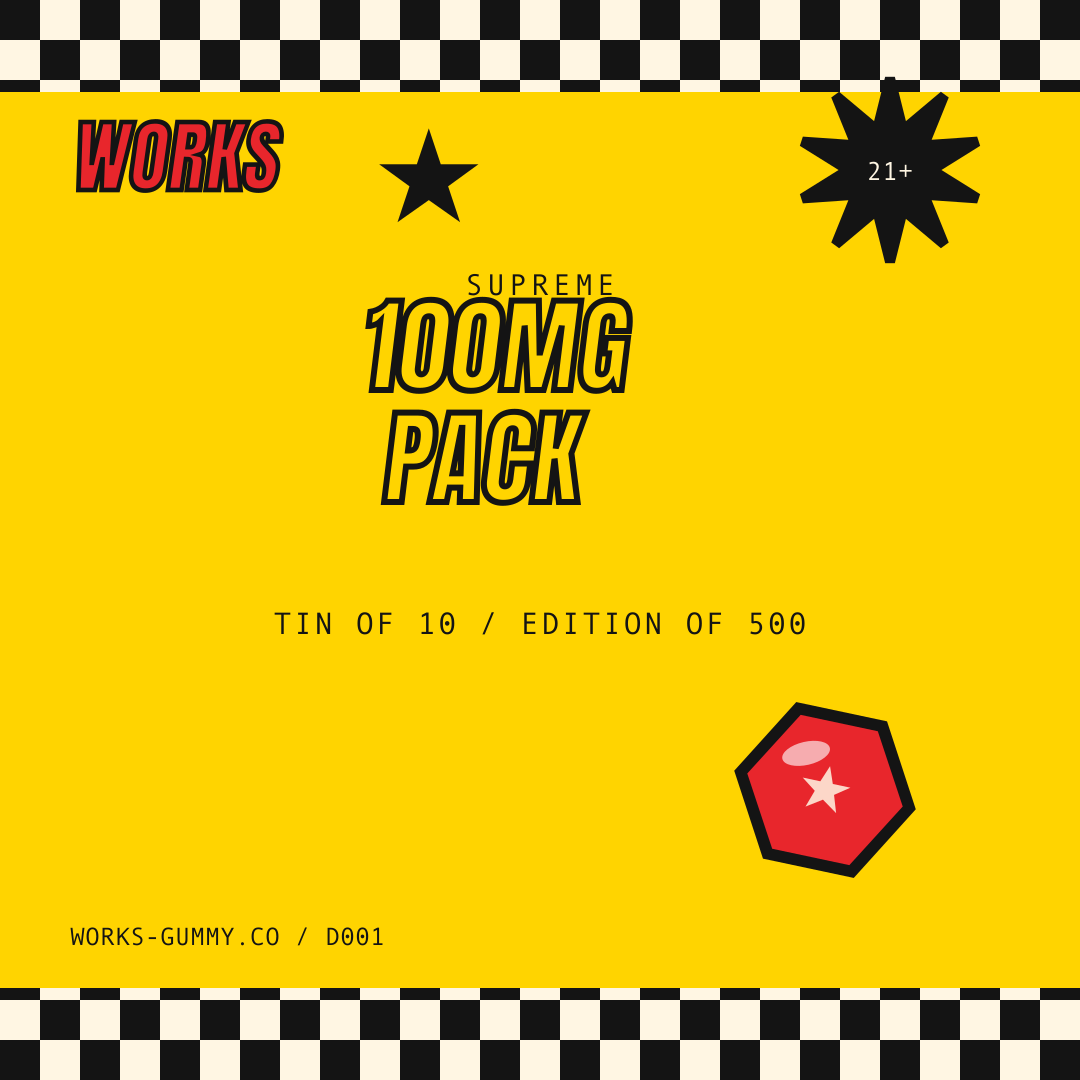
WORKS Gummy Co is a cannabis gummy brand built on a drop model: small batches, lab tested, no restocks. The product line runs three effect families, GTFS, GSD, and JWC, on a rigid dose ladder from EXTRA 5mg up to the SUPREME 100mg tin.
The brand needed shelf presence loud enough to carry that system at a glance.
The approach
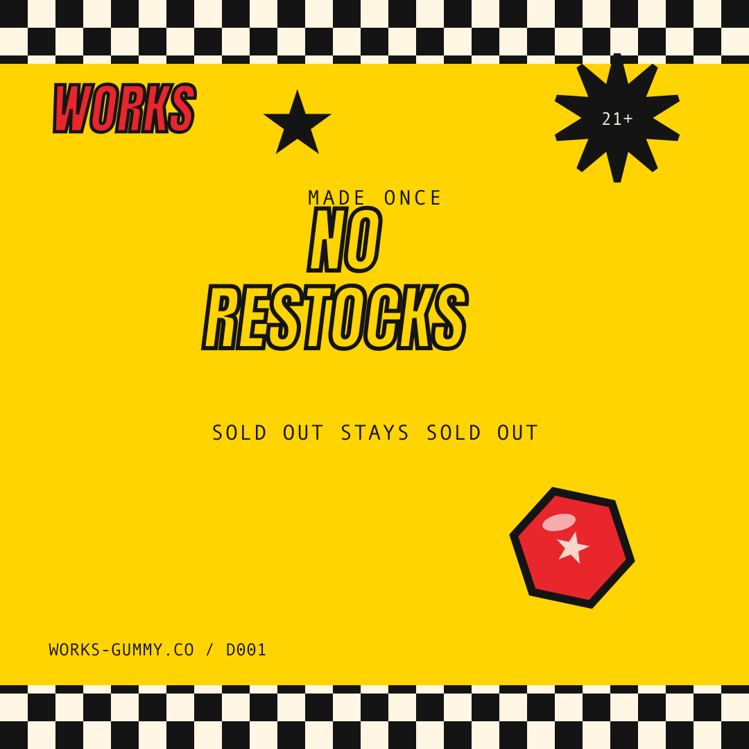
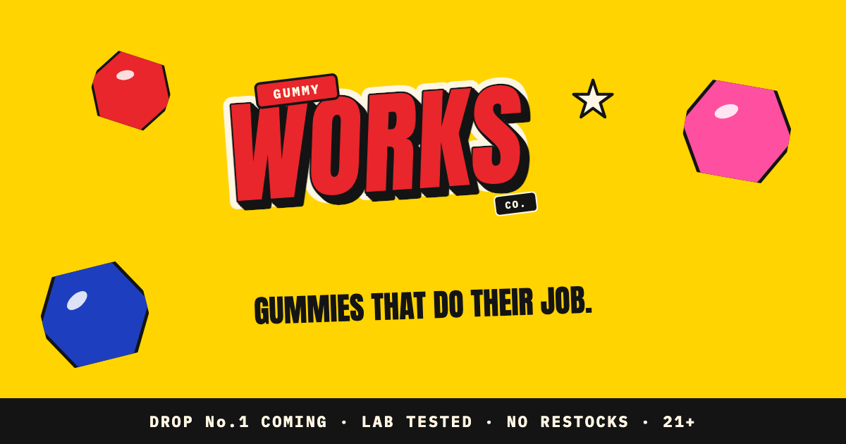
The v3 pop round rebuilt the identity around a comic-block logo with ink outline and extrusion, a gum-yellow field, checkered strips, and glossy hexagon gummies drawn right on the pack. Each family owns a color: royal blue for GTFS, cherry for GSD, hot pink for JWC.
The copy rule is strict: numbers and three-word lines, no paragraphs on consumer surfaces. The launch rolled out as a nine-post social campaign with frame animations.
Deliverables
01
Brand Identity and Comic-Block Logo
02
Bag Packaging System, 3 Families
03
SUPREME Tin Lid Design
04
Nine-Post Launch Campaign
05
Social Frame Animations
06
Brand Guide