Internal Project / Product Brand
The brief
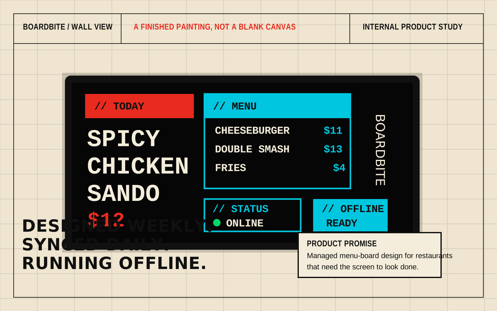
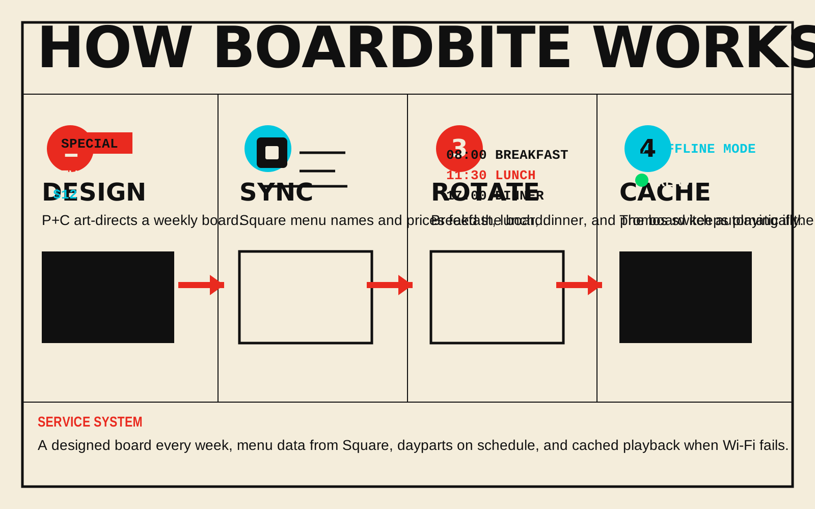
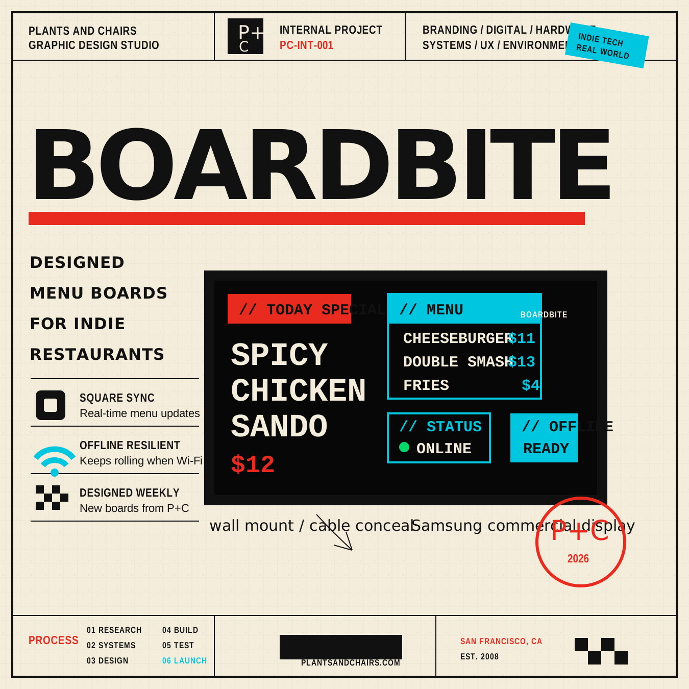
Independent restaurants run on paper menus that go stale the moment a sell-out happens. BoardBite replaces that cycle with a managed design service: art-directed weekly boards, Square menu sync, daypart scheduling, and offline resilience so the screen never goes blank.
The product needed a brand as direct as the food it serves.
The approach
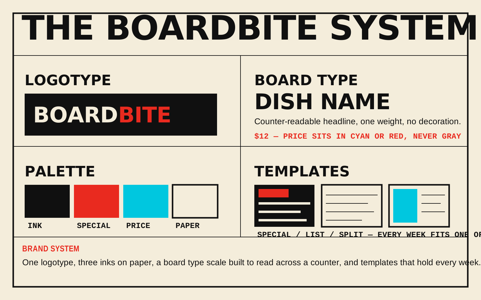
The visual system is built around three claims that can be shown, not just said: designed weekly, Square-synced, and offline-resilient. Menu typography is heavy and deliberate. The palette is navy, cream, tomato red, and cyan utility accents.
The launch study turns the product into a repeatable pattern: a sharp cover, screen-ready board graphics, product proof points, and outreach language that make the offer clear at thumbnail size.
Deliverables
01
Brand Identity and Logo System
02
Designed Weekly Menu Boards
03
Square Menu Sync
04
Offline-Resilient Display System
05
Hardware Kit and Wall Mount
06
Product Launch Case Study