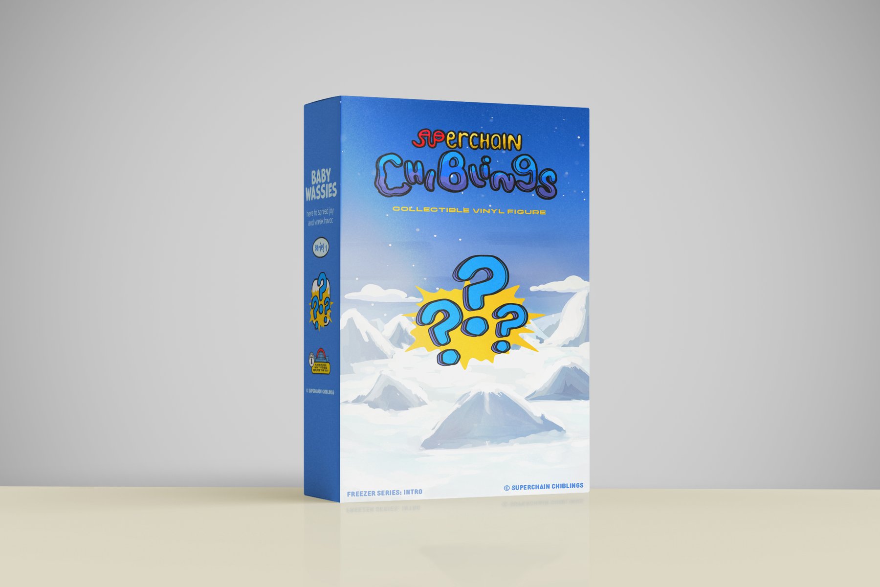
10 / Packaging
The premise
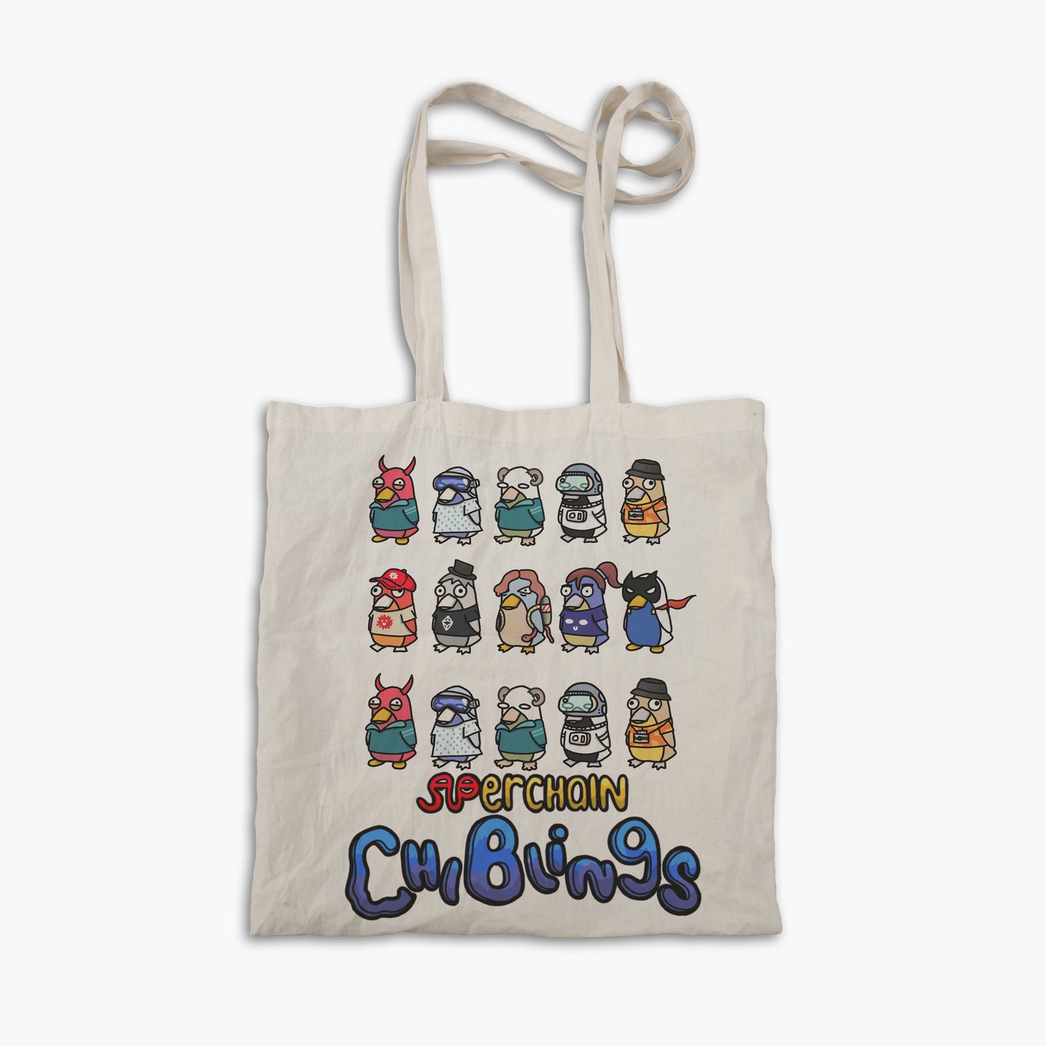
Chiblings is a Superchain-native IP: ten-plus original characters, each with its own color story.
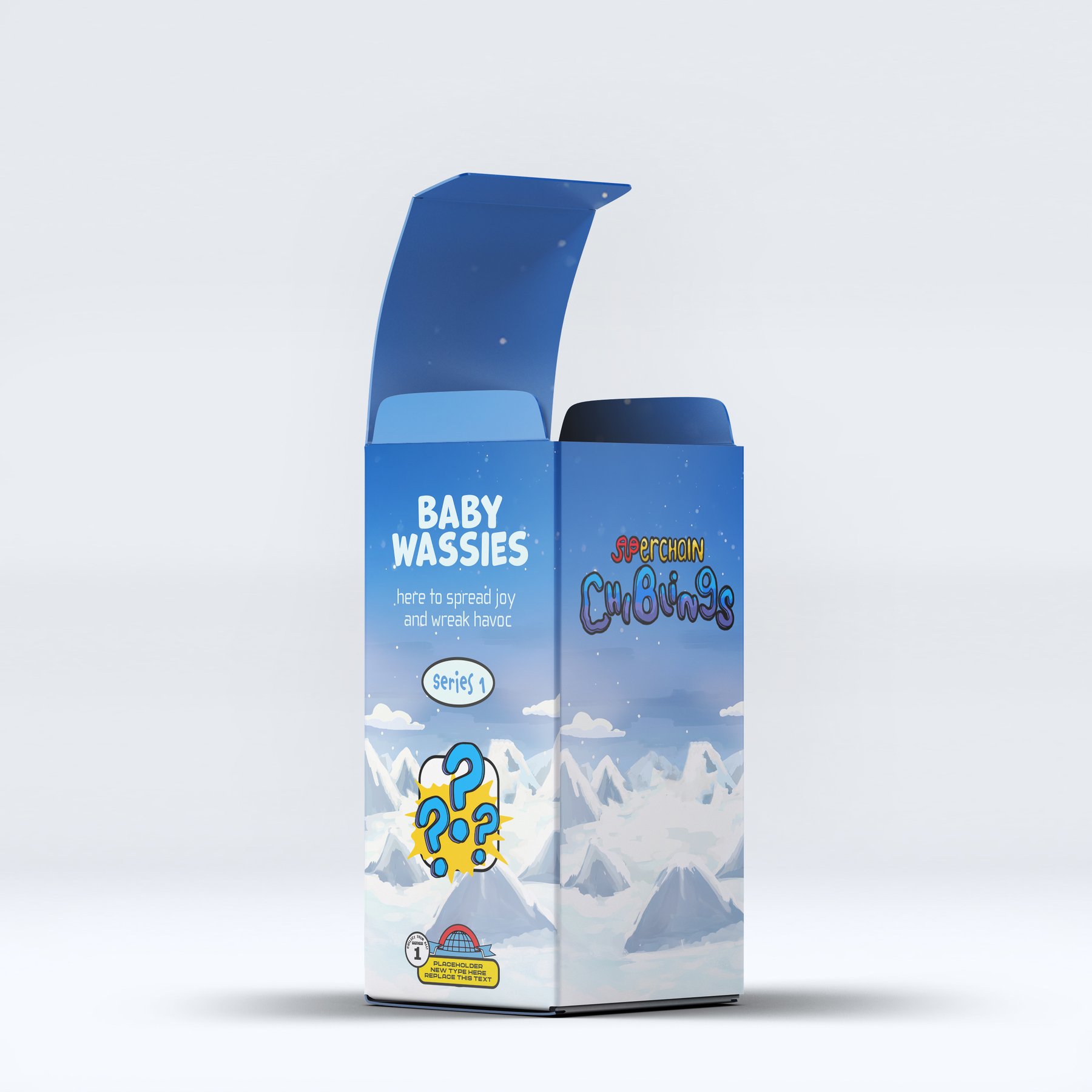
The brief was to take a digital art collection and give it physical form, translating that DNA into a packaging system that flexes across four very different formats while still reading as one family.
The system
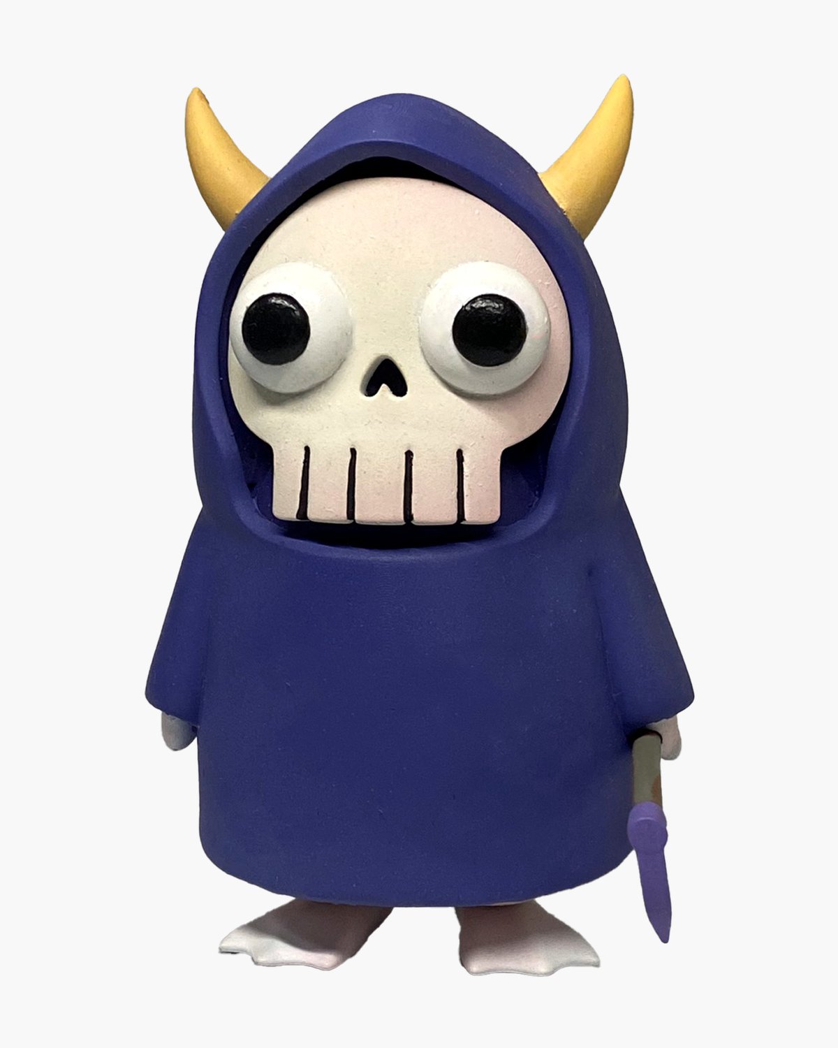
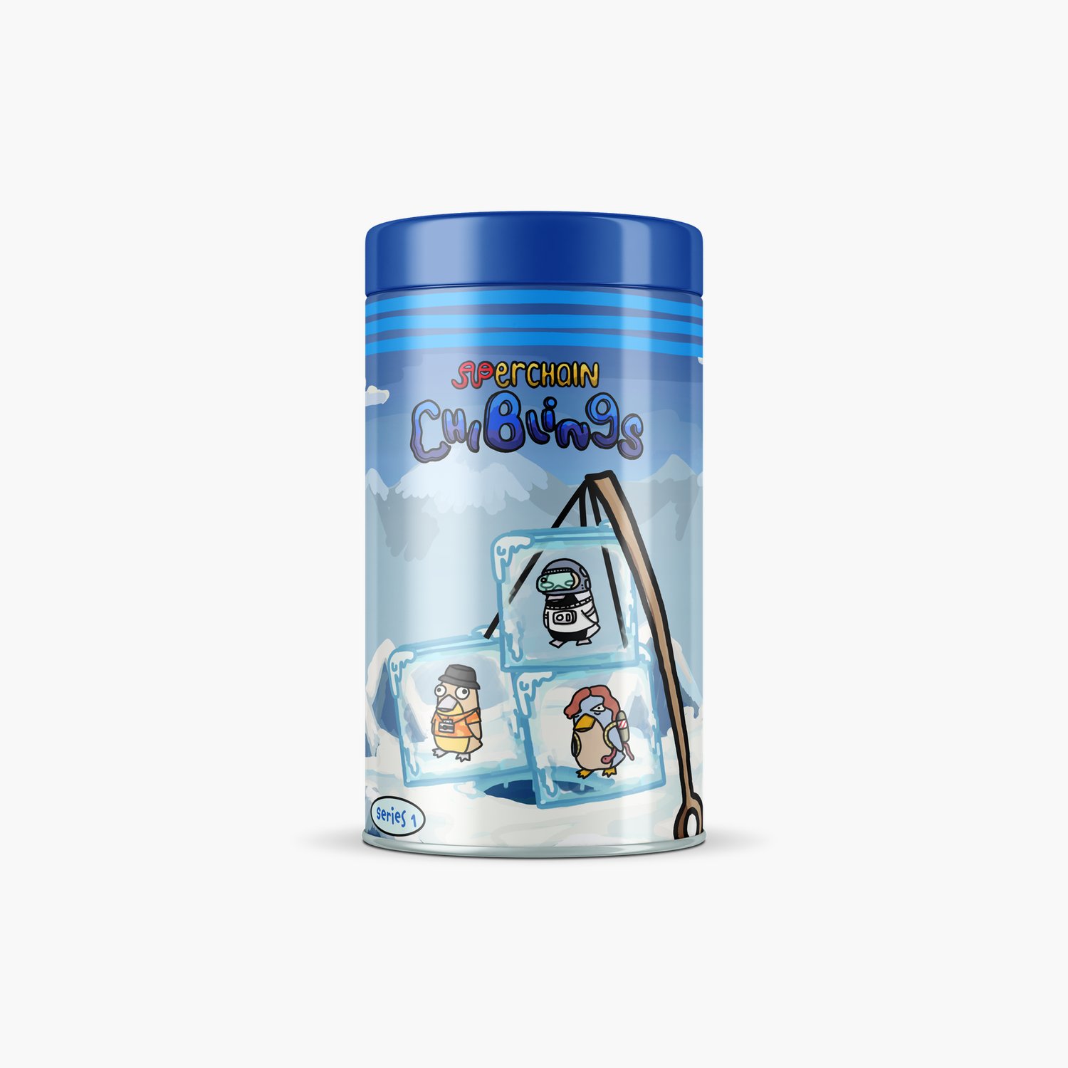
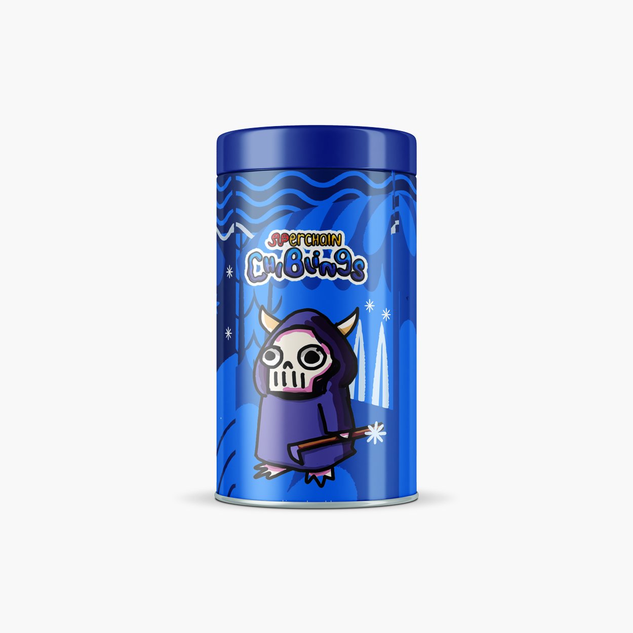
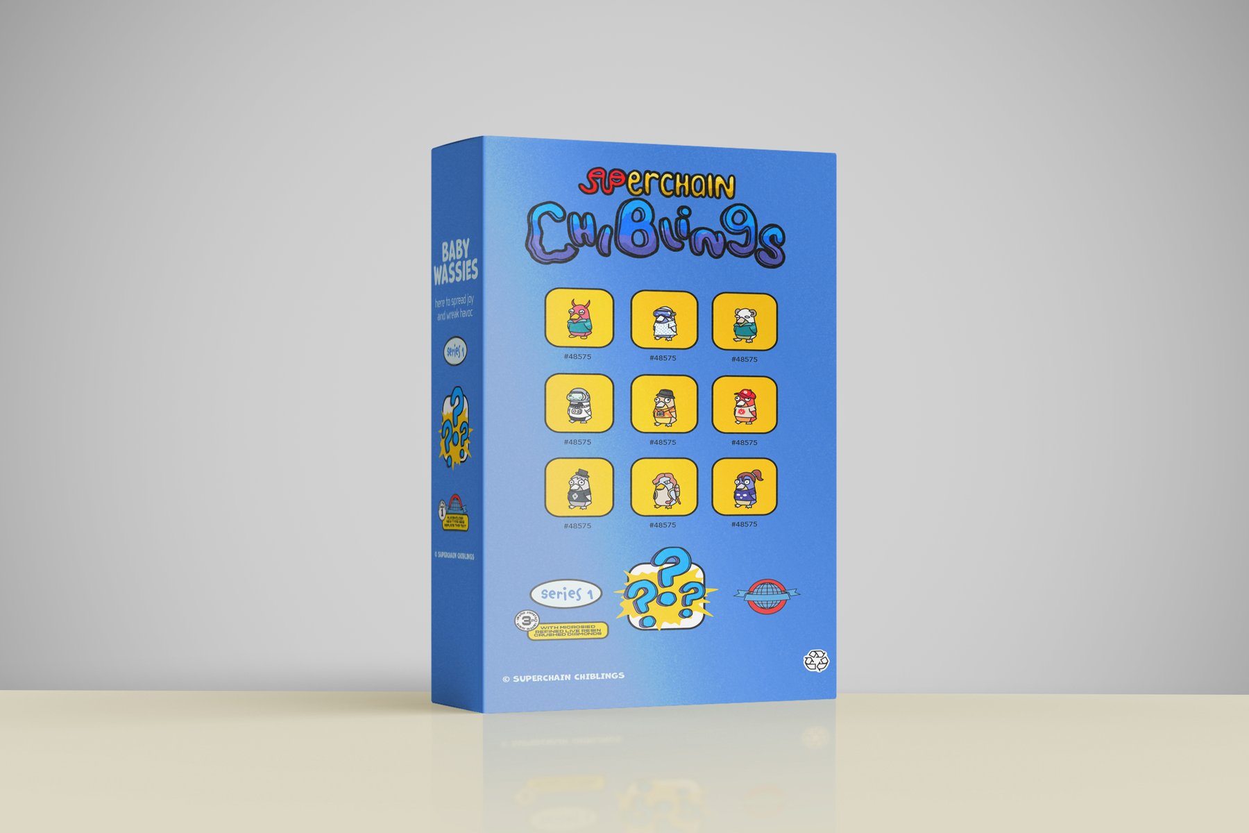
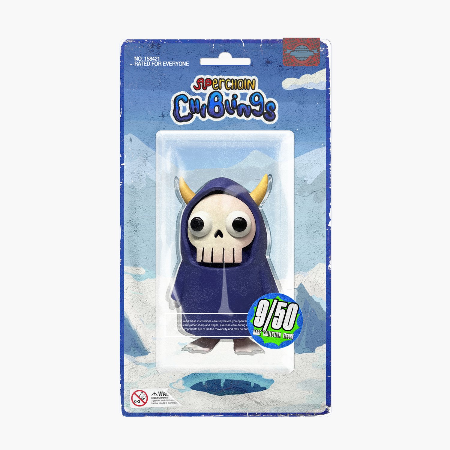
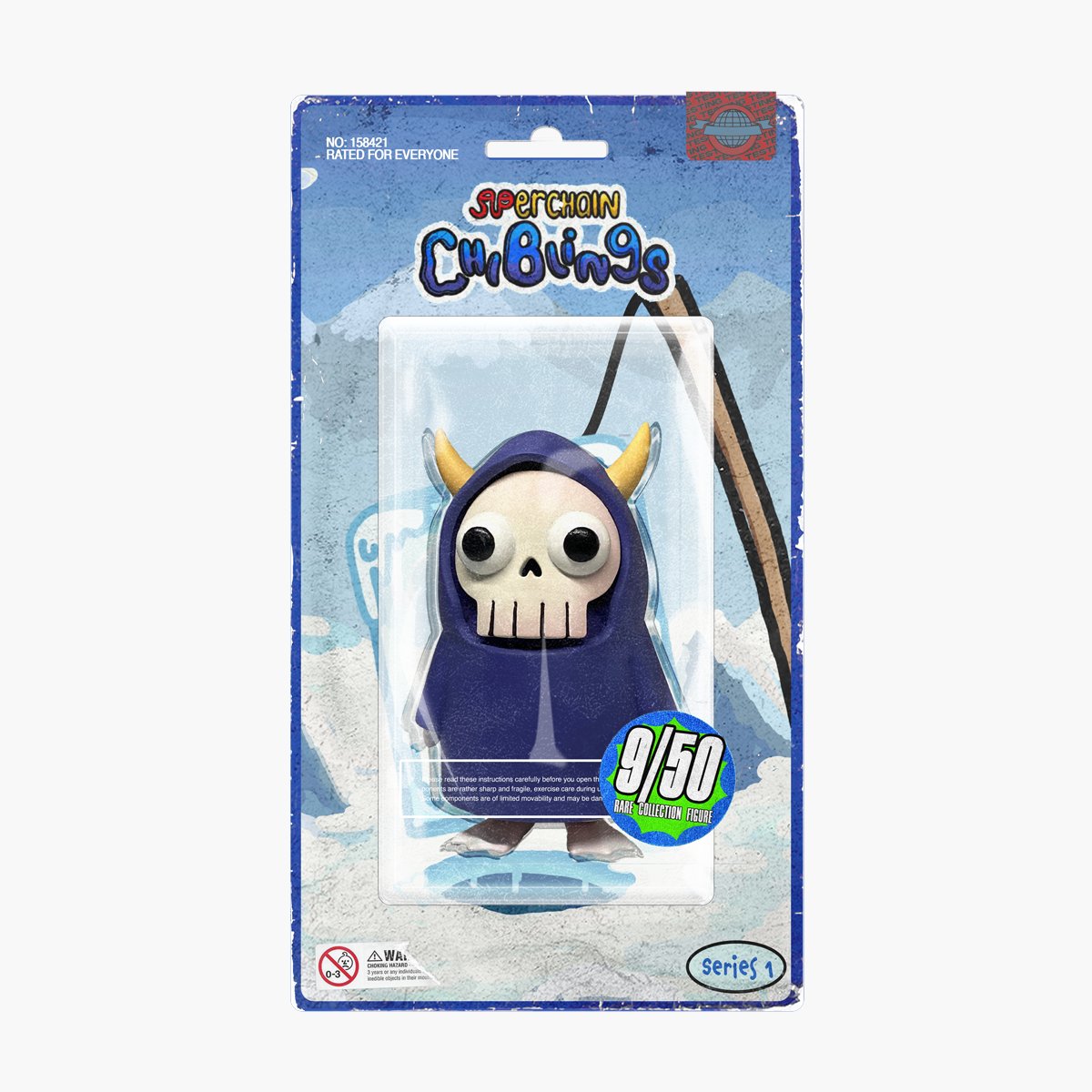
Cereal boxes, tin cans, pill bottles, and action figures. Each format has its own shelf logic and its own constraints, and each character brings its own palette, so the system had to hold ten-plus color stories without fracturing.
What unifies them is structure rather than color: shared layout architecture, one type hierarchy, and a single voice across every SKU. The line extends into pins, totes, and figures, so the collection reads as a toy brand rather than a set of one-offs.
Deliverables
01
Packaging System, Four Formats
02
Ten-Plus Character Variants
03
Collectible Toy Extension
04
Merch and Accessories