09 / Brand Identity
The premise
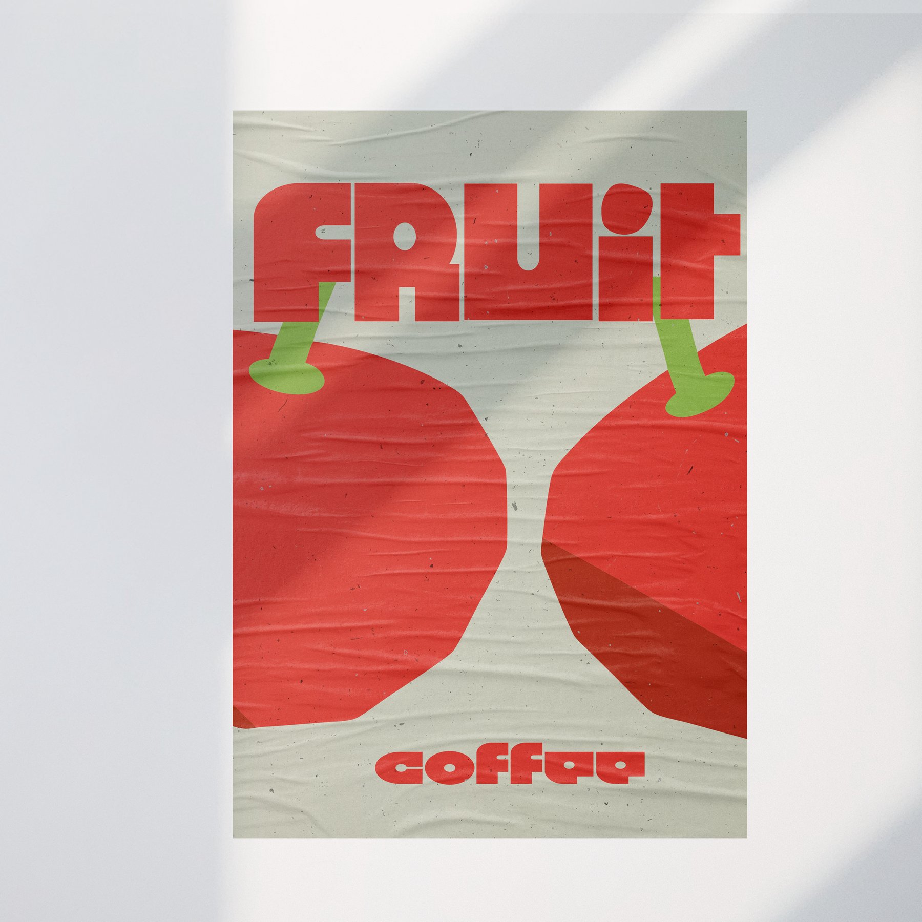
FRUIT Coffee is a specialty roastery in Dubai. The whole brand stands on one fact most coffee branding ignores: coffee is a fruit.
Specialty shelves default to Berlin minimal, muted tones and thin type and quiet confidence. FRUIT needed the opposite. The brief was an identity as sharp as the product: the loudest voice on the shelf and on the screen, without tipping into noise.
The system
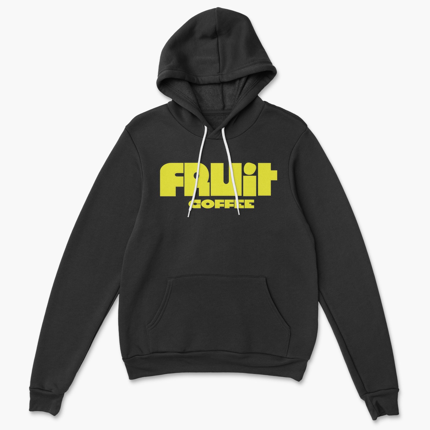
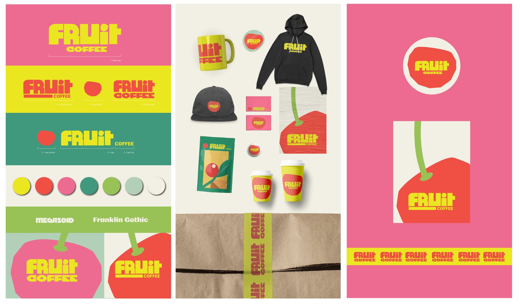
We built around a red fruit mark and a two-color core, red on cream and yellow on red, backed by a repeating brand pattern. Discipline is what keeps it from shouting itself hoarse: red is capped at 15% coverage per surface, accent only, never decoration.
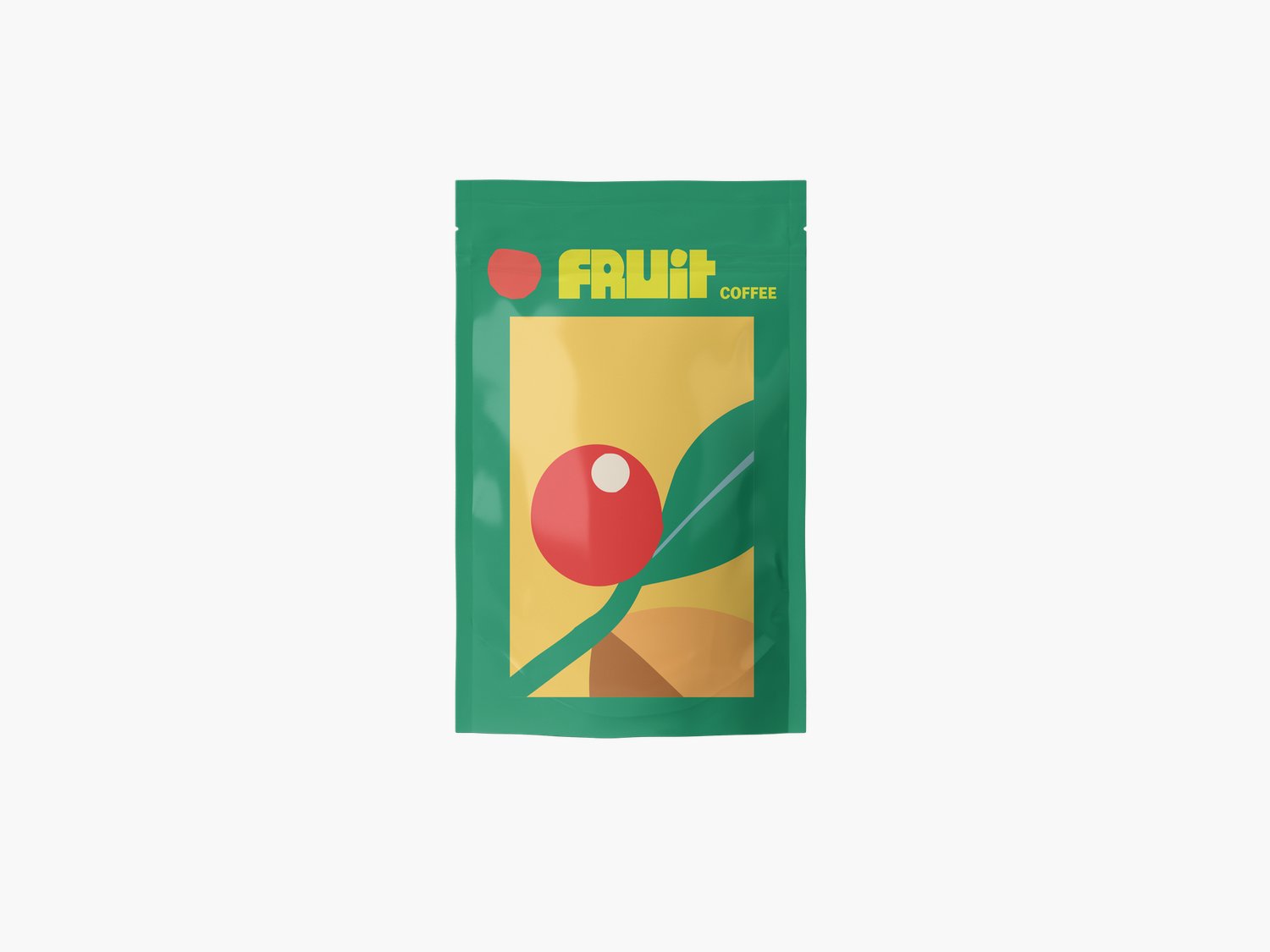
Five flavor-family colors map directly to SKU wayfinding, so the packaging does the navigation work a barista would otherwise do. The same logic carries to the web, where nine Shopify Liquid templates take it from shelf to screen. One idea, pushed all the way through.
Deliverables
01
Logo and Mark System
02
Color and Pattern
03
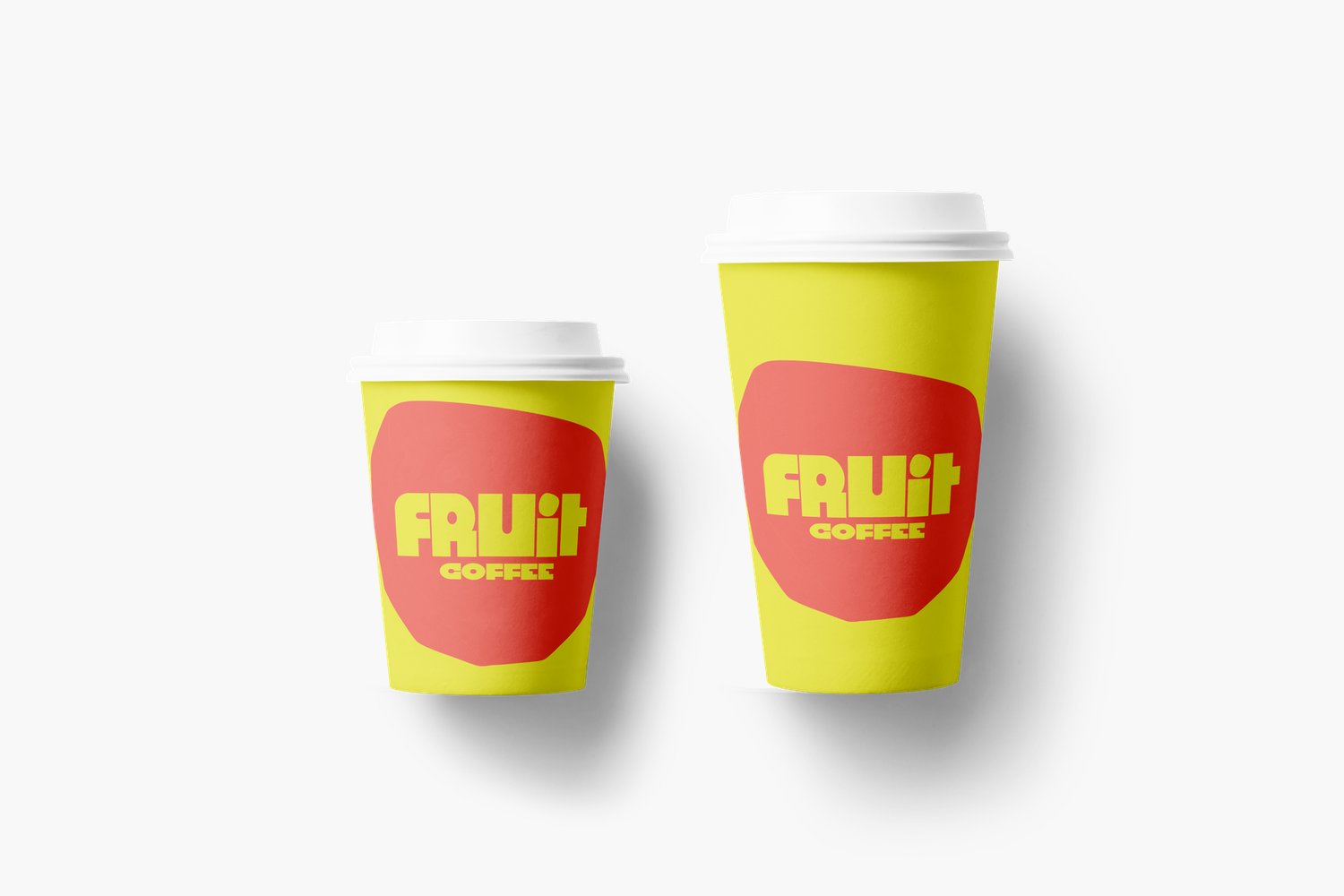
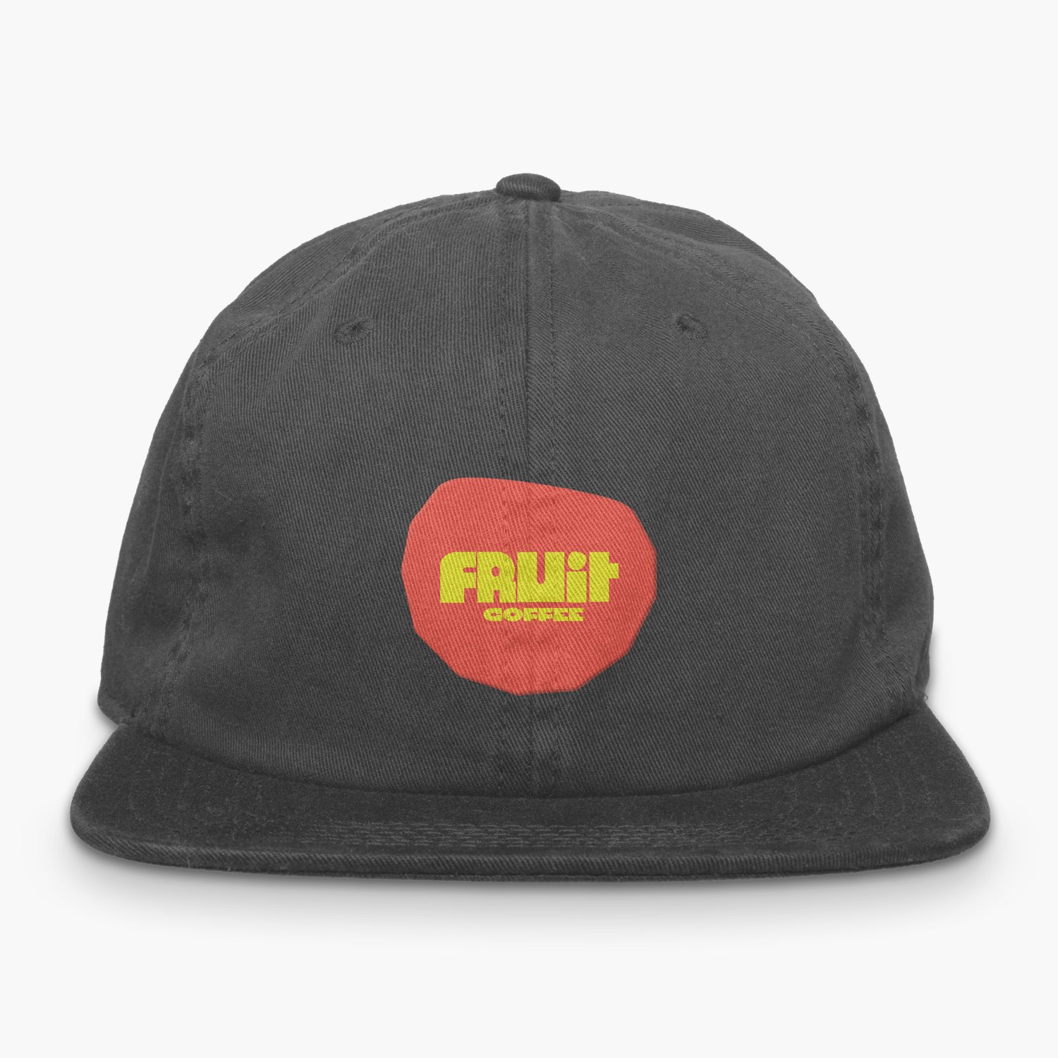
Packaging and Merch
04
Nine-Template Shopify Storefront